
Wednesday, January 30, 2019
Tuesday, January 29, 2019

Sunday, January 27, 2019

Saturday, January 26, 2019


Thursday, January 24, 2019
"Moon and Tea" - 34
but after a break, went back and finished it - still a bit of wet reflection, but otherwise........


"Moon and Tea" - 33
try as I might, tho thought could do the sky in one fell swoop, the hand/arm would not co-operate, - but did get half down...


Wednesday, January 23, 2019

Monday, January 21, 2019

Friday, January 18, 2019
"Moon and Tea" - 30
been a busy on other matters past couple days, including my doc visit [am in good health], but have gotten this far on the background tree -

Sunday, January 13, 2019

Friday, January 11, 2019

Thursday, January 10, 2019

Tuesday, January 8, 2019
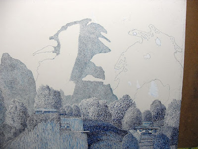
"Moon and Tea" - 26
another background tree done, and finished the middle ground trees, and indicated the rest of the background trees... next, tho, will be the stream..


Friday, January 4, 2019

The Next to First -
Next
to Vierge, the most influential of the early pen and ink illustrators
was Joseph Clement Coll - a self-taught wonder who had the ability to
imagine much of his 'world' while adhering to researched period costumes
and animals and the like... he took the issue of drama to fantastic
heights of rendering, extending the possibilities of what ink could
do... in doing his renderings, he would often cloak himself and his
board, shutting himself off for hours from the real world, so he could
'see' his own and then draft the rendering with all the imaginative
angles as if a cameraman at filming, being a god bestowing the drama of
his creations...


The Idea of Theming -
It
was mentioned about 'upgrading' pen and ink rendering to Fine Art...
what would this mean, and why be wanting to do this? the issue has to
do with theming, something which most artists are only dimly aware of,
and rarely ever having had any understanding of its nature, let alone of
its importance... in visualizing the universe, the world around
oneself and/or especially the world within the four corners of the
canvas [whether actual canvas or not, but a convenient metaphor for the
support on which the rendering is done], there is, for the artist, a
necessity, whether consciously seen or not, to sift and choose among all
the possibilities, what is considered by the artist of primary
IMPORTANCE - indeed, within that universe of creation, by the nature of
this choosing, everything which is deemed of importance enough to
include is as such metaphysical in importance, precisely because in the
choosing, whatever is included assumes fundamental values to the
artist... why? as I see it, it is because in creating a work of art,
especially Fine Art, an artist is involved in 'selective
re-presentation', of necessity - because not everything CAN be included,
thus what is, HAS to assume prime importance, whether consciously
considered or not... further, the more an artist consciously is aware
of this process, the more an artist deliberately strives to arrange and
compose according to this premise - the more consistent the end result
will be, and the greater the work will be in consequence...
This is, actually, a logical extension to the illustrating [which, of course, also dealt with theming, but from the standpoint of the story and not the rendering itself]... here, tho, it is raised to the work itself, for the work itself, so that one can contemplate the work and grasp that there are layers to it [like the proverbial onion], which in essence is what elevates it beyond mere fancy sketching, or even crafted drawing, to Fine Art - just as is the same with the better works in other mediums...
This is, actually, a logical extension to the illustrating [which, of course, also dealt with theming, but from the standpoint of the story and not the rendering itself]... here, tho, it is raised to the work itself, for the work itself, so that one can contemplate the work and grasp that there are layers to it [like the proverbial onion], which in essence is what elevates it beyond mere fancy sketching, or even crafted drawing, to Fine Art - just as is the same with the better works in other mediums...
In
showing, thru his/her renderings, what is considered of prime
importance to consider by others in this contemplative measure, this
means that even in doing scenes, there needs be more thought to
placement of the objects within - their relative sizes, detail emphasis,
and so on, so as to better being out the showing of the artist's
intent... after all, an artist, a painter, like a writer, is
communicating with others, the showing, the visualizing - it is the
means of communicating, and if it is unintelligible, then there is a
failure to communicate [and if there is a claim of not wanting per se to
be communicating, then there is no sense in there being a showing]...
For
pen and ink artists, this almost comes with the territory, so to speak,
because of the conscious attrition of the unforgiving ink, requiring
forethought before depositing, and thus forethought on where and in what
manner is to be depicted what is to be deposited by the ink... this, in
turn, fosters the creativity, which is an offshoot of this
fore-thinking in composing... even in such renderings as portraits, both
human and of animals and or/ objects like vehicles or buildings, how
these are depicted owes much to the creative thinking, even if heavily
taken from photographic references - which, for one, is why they are
superior to photographs, for all the attempts of configuring character
to the photographic images themselves... for many if not most, all
this is more or less intuitive - but the more one is conscious of this
and deliberately composes the rendering to this, the better the work and
the more a pen and ink artist can claim to be doing Fine Art...
Thursday, January 3, 2019
some reflecting thoughts -
In the beginning -


Note his mannerism of extending emphasis, details setting emotions, and high drama - all made possible by the advancement of technology to allow the printing of such intricateness...

This
is an opening declaration of fellow ink artists to elevating pen and
ink works to the appreciation of fine art... to begin, here is an
example - "Mother Lode", 32"x40" -
One
of the things which I hope to see here is taking an old art form, ink,
and elevating it to more than mere sketches and even drawings, which in
general are means to ends - and instead have the ink works be as ends in
themselves, Fine Art in other words, finished works that stand on their
own... to a degree, this was accomplished near the end of the 19th
century as illustrators began flourishing and works by such artists as
Howard Pyle, Franklin Booth and Joseph Clement Coll plied their
expertise and imagination - but there is a difference between
illustration and fine art, similar as they may be, namely that
illustrating is a means to the end of showing visualizations of
particular tales in such as books or magazines, not, as Fine Art per
se... however, by the same score, many of what passes as Fine Art also
in effect illustrated - myths, portraits, visual recordings of areas,
animals, objects and so forth... so the line is blurred, in part
because little attention had been paid to seeking to understand the
nature of Fine Art and why it differs from pre-photographic recordings,
or propaganda posters, or decorative art - especially this latter...
hopefully, in time, a collection of these Fine Art renderings can be
gathered and exhibited and in their viewing help establish the high
quality of composition, inventiveness, and skill that goes into their
creations - and as such be seen for the Fine Art works they really
are...
Just
so there is no mistaking, here is an example of colored ink fine art -
"Opening Ritual, Second Cup", 20"x30" ["Opening Ritual" is the same only
in b/w]

While
pen and ink, of course, has been around for untold centuries, it wasn't
until the late nineteenth century that modern developments brought
forth possibilities in printing illustrations which allowed full range
of the modern pen's possibilities... the first one who was able to
utilize this was Vierge, who brought, as consequence, an elevation to
the art of being a pen and ink artist far beyond what had been done
previously...


Note his mannerism of extending emphasis, details setting emotions, and high drama - all made possible by the advancement of technology to allow the printing of such intricateness...
One
has to realize that before the 'golden age' of pen and ink
illustration, ink renderings were in general considered as sketches for
further or finished works in oils... it wasn't until the advent of
being able to illustrate in the manner first shown by Vierge that the
possibility of pen and ink as Fine Art could arise - principally because
only then could the value of inducing all the shades and drama of
other's paintings [when first was considered], then quickly one's own in
terms of value work, was seen as something most suited to the black and
white of ink...
WHY PEN AND INK...
I can only speak for myself, but the appeal of the ink is its finality - one has to, in general, know what one is doing when applying the ink, for ink is rather unforgiving - if you make a mistake, it has consequences... secondly, there is an appeal to the 'either/or' of the black and white - and the fun of seeing how much variety one can render out of those extremes [am speaking here, of course, with the basic black ink on white surface - colored paper and/or colored inks merely add more dimension to this]... in no ways am suggesting that stippling is the only, let alone the preferred, way of rendering - far better, actually, to combine as needs require whatever techniques fulfill the requisite need, as long as all fits in harmonious relationship [something sometimes overlooked in the quest for diversity]... too, there is an element yet in this day and age where pen and ink, especially if dramatically rendered, and even more so if rendered large, gives an elegance and grace to a wall, especially if framed in simplicity, that often is lacking in 'regular' paintings...
I can only speak for myself, but the appeal of the ink is its finality - one has to, in general, know what one is doing when applying the ink, for ink is rather unforgiving - if you make a mistake, it has consequences... secondly, there is an appeal to the 'either/or' of the black and white - and the fun of seeing how much variety one can render out of those extremes [am speaking here, of course, with the basic black ink on white surface - colored paper and/or colored inks merely add more dimension to this]... in no ways am suggesting that stippling is the only, let alone the preferred, way of rendering - far better, actually, to combine as needs require whatever techniques fulfill the requisite need, as long as all fits in harmonious relationship [something sometimes overlooked in the quest for diversity]... too, there is an element yet in this day and age where pen and ink, especially if dramatically rendered, and even more so if rendered large, gives an elegance and grace to a wall, especially if framed in simplicity, that often is lacking in 'regular' paintings...
Subscribe to:
Posts (Atom)