One of the things which needs correcting on is a misconception that titles are extraneous fixture to all but literature... wrong... titles[or theme/titles, as I prefer to consider them ] are, properly, as much an integral part of the rendering as is the case with writing... perhaps it is more so, since it is the key to elevating the rendering from just a 'sense of life' to something more... initially, of course, the viewer is drawn to the visual work sans anything else about it... without knowing ANYTHING else - artist, title, era in which done - the work is first viewed as a glimpse into a self-contained world... it is seen as a universe on its own... within that framework, tho, there is much which can be gleamed...
The metaphysical view, for instance, is instantly discernible - there is a vast difference in how a benevolent universe view contrasts with a malevolent one... is it a world of flux, or is it one of identity? if a landscape, are there vegetation, or is it barren? if vegetation, are they blooming, dying, or dead? are animals in health, or malformed? the humans - happy, serious, fearful? are the colors bright or murky? is it viewed with clarity, or is it as if from a nearsighted without glasses? what is the most prominent feature - the main focus? how is humanity placed within this universe? what size - larger than life, or tiny and insignificant? if no figures, what are the main entities - how are they placed? is there a significant difference of size between setting and object? is the emphasis placed more on one thing than another? figures - their posture: upright and proud or elegant, or bent and awkward? is the painting smeared or distorted, or orderly and complex? the light - bright, or subdued? in still life, are the objects glistening, or tarnished? are they solid, or fractured? and the list goes on...
Make no mistake - few artists are aware of any of this, unless perhaps they took aesthetics in some studies, and even there it often is glossed over for other considered more important matters... far fewer artists, even if aware, have any concern with any of this [and note, am speaking of artists in general, as this applies to at least all of the visual art mediums]... most artists came about their being artists as a form of displaying the skill of rendering, of sketching an object or scene with an ability beyond what most others seemed to possess... continued use gained greater ability, such that, in some cases it led to selling what was rendered, or making copies of the original and selling those... in none of these, however, was there an awareness for the most part in wanting to learn anything more regarding what they did other than the technical skills to better achieve what they were doing... one could say it was a practical attitude, much like crafts or trades... this is not as such to demerit their doing, merely to emphasize that for the majority, that is what is meant by being an artist - and their works, for the most part, are a sort of 'here today, gone tomorrow' kind, without much of any lasting tribute than 'twas nice', whether a scene or still life or whatever...
With pen and ink artists, it is largely the same - yet they have a more forbearing incentive to seeing the best of their efforts seen as Fine Art, as more than just a 'twas nice' rendering... to give a similar example, consider colored pencil renderings, how for many years they were just temporal works used for illustrating in magazines and architectural studies and so forth - until some of them wanted to take that skill and 'fine art' what they did... take a look at their works now, what they choose to render, what thought went into what they rendered, and how painstakingly they rendered - see colored pencil as Fine Art... there is a difference in the 'before' and 'after'... the same can and ought - and NEEDS BE - with pen and ink, if the goal is to achieve that same end...
And GREAT art, to be great, requires awareness of the means of greatness - even if few works succeed at it or artists care to strive for it - if for no other reason than it gives satisfaction to the artist of being successful in showing, in communicating, what is thought by the artist as of great importance - and that all the elements involved in the composition is integrated to that end...
At least that is my view of the situation...
I should add that if what one wants to do as a pen and ink artist is to do scenes and/or character work [I prefer that more than to say portraiture], I am not disparaging it nor discouraging it - indeed, GO FOR IT, for that is what gives the satisfaction... but - if such is, like is for me, not enough, then what has been written is a way of furthering the seeking of that satisfaction that otherwise is not there... at the least, even if scenes are the forte, knowing all this other can aid in improving that, crystallizing the essence more so than would have been if not knowing... remember, the essence of art is 'for contemplative purposes' - it is why one goes and looks at a work over and over and over, savoring the impact received, being refueled by the savoring...
.JPG)
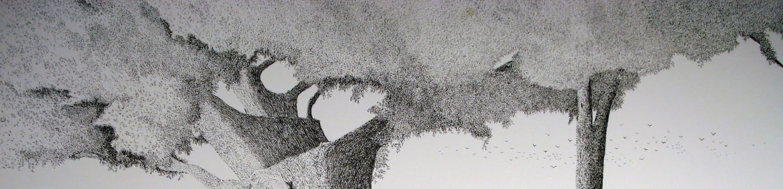
.JPG) Getting in a wee more before calling it for the day, this shows the area done - note am working my way back to the left, filling in the leaves and adding a couple branches to be seen...
Getting in a wee more before calling it for the day, this shows the area done - note am working my way back to the left, filling in the leaves and adding a couple branches to be seen... .JPG)
.JPG)
.JPG)


.JPG)
aa.jpg)
aa.jpg)


.JPG)
.JPG)
.JPG)


